|
There I was minding my own Facebook business when suddenly an avalanche of opinions started pouring through my feed. Logo this, logo that, city this, city that--honey, grab the pitchfork, we've got a logo to fight off!
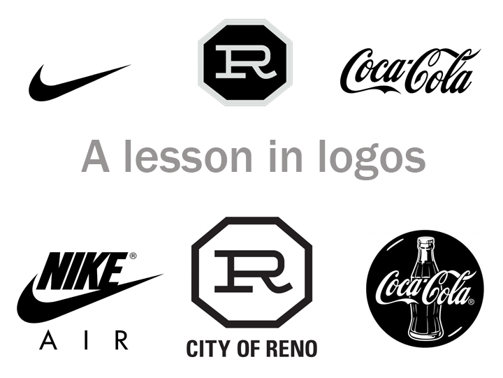
In my decade+ of graphic design experience I had never seen design criticism in such magnitude. A whole city with an opinion! If only Logos were on the ballot in November, the polls would be filled! I have been watching the Biggest Little City campaign for the last few years with glee, admiration and respect. I had the privilege of attending a luncheon that explained all the details, the passion, the reasoning. It was the ultimate Logo Presentation, and the citizens of Reno who never had a chance to attend--certainly missed out. So let's go through some of these SUPER GREAT questions/comments that have been surfacing in Reno's great design school, Facebook University, where people go to hone their art and graphic design skills so they can fit in with the Teslas, the Apples and all the other innovative Joneses that are so far ahead I am wondering if Texas wants a second shot at the bid. Question/Comment #1: It looks like a cattle brand. We don't need no stinkin' cattle brand. We ain't no cow town! Well when you put it like that! See the image above. All great logos can be turned into cattle brands. The term branding came from cattle branding--it is how a rancher could distinguish his cattle from the neighbor's cattle. Just like when you go to a store and you want to grab your favorite brand, you look for the tag, the label, that signature button. It's usually not super obvious, just tucked inside the collar; but God, you get a sense of pride when you have your favorite brand rubbing up against your body all day. The Reno BRAND is subtle and simple--the way a good brand should be. It works on a subconscious level, tucked into a corner, supporting and identifying whatever wall, sign, shirt, store or project it is attached to. Your psyche spots it as you walk by, and you smile. You're not sure why, but there is something inviting about that building, that event, that business. You want to go in, something is beckoning you! That is why it looks like a cattle brand! Question/Comment #2: It's too simple. Again, look above. The beauty of a simple logo is that it can evolve and function with more complex concepts. Have a white wall? Use the black version of the logo. Have a black wall, use the white version. Want to call it Christmas in Reno--try it in Red and Green*. I'm sure you can recall a few variations of the Nike and Coca-Cola logos. Successful marketing operations rarely go back to the drawing board completely; they just make variations on the theme. Why? We don't want you to have to rebuild a psychological impression every time the seasons, the dimensions of a billboard or the Facebook timeline cover requirements change. By utilizing a simple logo, other concepts can be built around it. Yes, it is simple. Awesome! Question/Comment #3: It looks like my 7 year old made it. Your 7 year old should probably go into graphic design immediately. Question/Comment #4: It's so old I think I've seen this before--when I was a baby. Hey--no one asked you your age, but since you volunteered--yes, great designers pull from historic elements of a business (or city) to give a timeless appeal to a logo. The logo is a throwback to the original Reno Arch. No one is looking to rewrite Reno's history; the creators understand that Reno's history is part of its greatness. But they also get that Reno's future can be even greater. Question/Comment #5: Stop? It's a stop sign!!?! OMG!!!!!! PANIC. An octagon is a respectable shape, and I don't think STOP has it trademarked. It's up for grabs, people! What does an octagon mean to you? Why do you associate that with a STOP sign? And why is that a bad thing in your mind? I just LOVE the psychology behind a good logo! A great logo WILL make you STOP and think, question, evolve. It might even make you want to STOP and stay in Reno for the night, the week--hell, maybe forever. But if you just can't handle the idea of more people stopping in Reno, consider a higher meaning of the octagon which deals with: Regeneration; Totality; Infinity; Rebirth; Transition. Huh. That sounds oddly appropriate. Question/Comment #6: Why do we need this. The old one is perfectly fine. I didn't even realize we had an old logo until this discussion came up. Then I saw the old logo and was reminded, "OMG that thing?! WE HAVE A LOGO AND IT IS SO 1997." I'm not going to bash it (much) because the previous logo was designed by committee and through intense government regulations. It fits all the requirements of the Facebook community, and well--that kind of explains it, doesn't it? To stay relevant to my clients I have to update their websites every month. And then we have to do whole website overhauls every year--just to keep up with technology. As businesses grow and they realize that their original image is no longer relevant--we have to also change their logo and branding. Reno is in an exciting place of transition and innovative growth. It's time for all of Reno to not only consider a new logo, but also a new wardrobe, a new career, a new place to dine, a new habit, a new route to work. If you're still comfortable with the old logo, it may be time for some deep spiritual introspection--what else have you been putting up with for the last 15 years? An abusive relationship, a horrible boss, an extra 40 pounds? Rebrand yourself. Tell the people that are bringing you down to STOP; you're getting a new logo, a new look. Hopefully the Facebook Community will be on board with the new you; I know I will! *provided that is allowed under the confines of the branding guide. |
Categories
All
|


 RSS Feed