 Every business will either eventually either close or be past to the next generation or sold to a new owner. That demands an exit strategy even if the business is new. Your exit strategy will vary based on what assets are part of the business. There are many important aspects to realize as transferable assets. 1. Real estate and improvements. Does your business have a visible commercial space that any subsequent business owner would desire? What about any specialized equipment or build-outs that are critical to the business you own? 2. Customer base. Do you keep a database of customers that a new owner would need to continue the business? If not, why not? 3. Website and Social media followers. Your website is an asset that is part of the value of your company. Particularly, your domain name may be worth hundreds or even thousands of dollars. Followers on Facebook, Instagram and other media can be worth paying for to a new owner. 4. Reputation. This is referred to as "goodwill." It's also considered "blue sky." Your reputation as a business entity can be a positive or negative as it relates to value. How you have managed reviews and customer complaints can affect your valuation and a prospective buyer's impression of any business. 5. Financial value. Most business transitions involve the buyer obtaining financing to acquire your "going concern" business. Having accurate financials that are current will be a critical part of justifying the sales price and make it possible for the buyer to be approved for a loan. While every business owner likes to minimize their tax liability, it is important to not understate revenue or overstate expenses when filing tax returns. Having an independent analysis of your financials that demonstrate the amount of financing the business can support as part of your sales strategy can not only help you get your price, but also assist a buyer when they go to their lender. 6. Condition. Deferred maintenance of the business property tells a story of the profitability of a business. In residential real estate, "staging" has become an important part of the sales process. The same is true of commercial and business sales. If the buyer feels they will have to make immediate improvements in the appearance, signage or other upgrades it will dramatically affect what they will be willing to pay. Waking Girl Company has helped many of their clients from coast to coast in the succession process. Having decades of experience in real estate sales, lending and marketing with members of their team, makes them a great first contact in making plans to sell. 775-544-6612 New small business owners have a lot on their plates, from figuring out financial projections to learning the ins and outs of marketing. For those who are just starting out, one of the main focal points of getting a business up and running is creating a brand, and there are several aspects involved in that process alone. That’s why it’s so important to give yourself plenty of time to build your brand’s identity and tackle all of the elements that go along with it, from brand management to creating brand awareness. Need help streamlining those details? Take a look at Waking Girl Web Design, where you’ll find an array of services that will help with everything from managing your social media posts to performing accounting tasks.
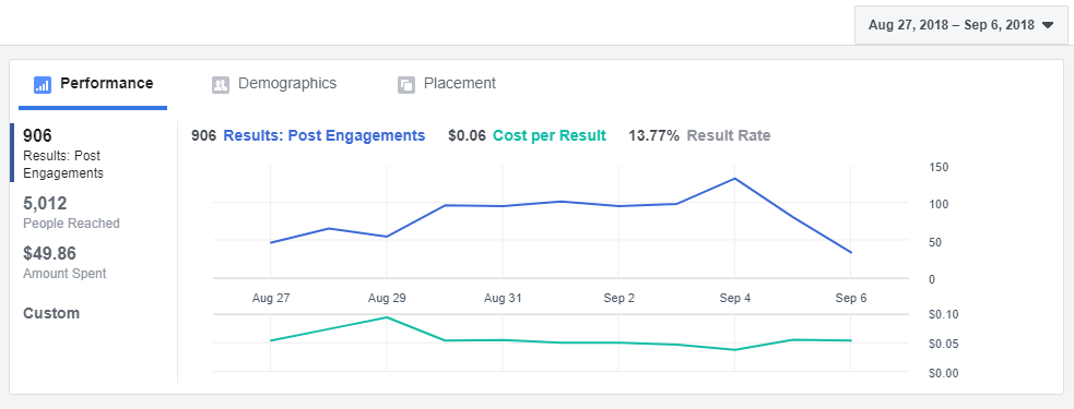
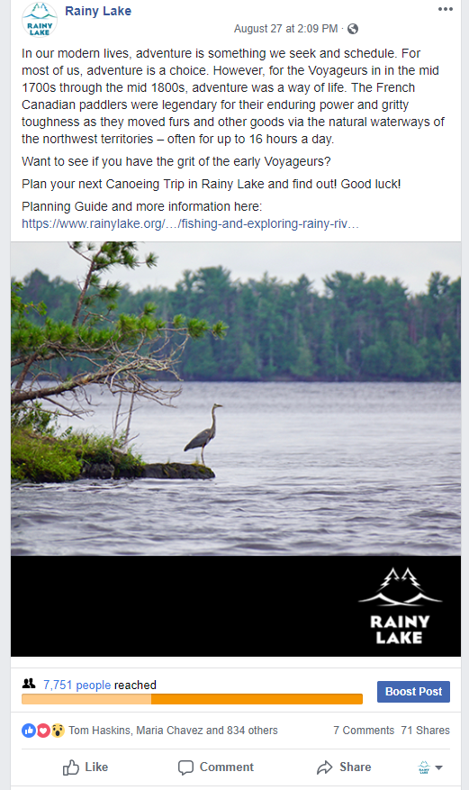
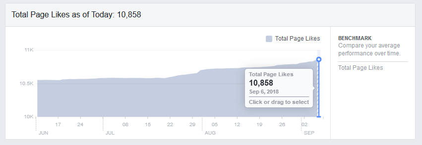
Before you can get started, you’ll need to think about your ideal customer and how you’ll reach them with your branding strategy. Let’s take a look at some branding tips so you can start your business off on the right foot. Learn all you can about your target customer No matter how popular your product is, it’s not realistic to expect every type of customer to buy it, which is why you’ll need to do some research on the consumers you’re targeting. What type of products are already available to them from your competitors? What are their needs? Where do they typically do their shopping? Are they teens, adults, or older adults? Creating a detailed composite of the ideal customer for your business will allow you to customize your branding to their needs and figure out how and where to reach them. Learn how to use social media to your advantage One of the most popular spots to reach customers is social media, but not all platforms are built the same, so it’s important to learn about the ones you prefer and create a strategy for making the most of your time there. For instance, how does their algorithm work? If you share a post at a certain time of day, will it do better than at a different time? It’s also important to utilize social media tools, such as paid ads, reels, and even memes, which are easy, cost-efficient ways to engage with your audience. Memes are especially great because they can be customized according to the type of message you want to get across. Here’s a meme maker that allows you to choose a template, then insert your text and background to create a funny, touching, or relatable meme. Make your brand memorable Once you have the right social media tools and a good understanding of who your customer is, you can start to build the elements of your brand, which include a memorable logo and/or slogan, imagery that stands out from your competitors, and those intangible factors that make your business great. Whether your strengths are stellar customer service or a commitment to protecting the environment, those details should go into your business’s mission statement so you can build customer loyalty. Figure out where you could use a hand As you start putting together the elements of your brand, think about the areas where you could use a little help. No business owner can do everything themselves, and some branding tasks are better left to the pros. If you’re not great at keeping up with social media posts, let the team at Waking Girl Web Design take over with a customized campaign. Because there’s so much that goes into social media for small businesses, having the support of an experienced team can help prevent costly or time-consuming issues, so you don’t have to worry about the details. Creating a brand for your business is an essential task, but it can also be an eye-opening one. Take some time to learn more about the process and what it entails, research your target audience, and use online tools such as meme makers to connect with customers. Ready to start building your business website? Reach out to Waking Girl Web Design to talk about a plan. Photo via Pexels  Recently, a not for profit organization had a change of Directors. This change was not foreseen as the Director was diagnosed with a terminal condition that quickly took her life. The organization failed to keep a record of passwords and other pertinent information that were necessary to edit their website, check email messages and access bank and credit card information. The Director probably had all that information saved somewhere, but where? So not only was the organization suddenly scrambling to keep up on the day to day activities the Director had been doing, they also found themselves in the dark as it related to all the technology that had been part of the organization. That is one reason to make sure the organization's website has a maintenance plan with your web designer. Some businesses try to save a few dollars by having a staff person manage their website. Every owner or board of directors should consider engaging their web company to maintain the site and keep access for edits and changes even if the employee is making some edits. That is like an insurance policy against having an employee quit or otherwise leave the business wondering how to manage the site without them. At the bare minimum, a hosting and maintenance plan should be included with your web company. If Facebook ads and Print ads were in a competition, Facebook ads would win almost every time. **The following is a conversation I had with a tourism based community about bringing more traffic to their town.** We can target people on Facebook who are fans of "Explore Minnesota Tourism." Just in the last week we have reached 3271 people in the United States who have expressed interest in "Explore Minnesota Tourism." From August 27-September 6 we reached over 5000 people. We have received engagement (a Like, Comment, Share, or Click-through to the website) from over 900 of those people. The hard Facebook ad cost of reaching this captive audience was just: $49.86. We have the potential to reach 180,000 people on Facebook who are interested in visiting Minnesota. The circulation of the Explore MN magazine is only 32,750 households. Our daily reach is estimated at 300-1700 people, based on effectiveness of the ad and the ad budget. As you can see in the graph, interest is now waning in this ad that has attracted over 5000 people: It takes more than just the Facebook ad budget to make an ad successful. Each ad requires: copy, a graphic and photo, and a Call to Action. Each ad also needs to be carefully watched each day. Fans need to be engaged with. Questions need to be answered, etc. Fans also need to be invited to become permanent fans of the page. This takes time and resources. Not every ad is successful. But it only takes a few dollars or a few hours to see if an ad is working or not. The most exciting thing about Facebook ads, is that putting money into it is like putting money into an investment portfolio. Every time we run an ad campaign, we see a gradual increase in Page Likes or Fans. Once we have a Fan, we can more easily reach him/her with organic posts and paid posts. We started the summer off with 10,500 Fans, and increased that number by 100 each month--June, July and August--we're winning people over for years to come! The Facebook Page's Fan base is roughly 1/3 of the Explore MN Magazine Ad circulation.
If we could use the magazine budget of $925 for their smallest ad (1/6 page), we could potentially reach as many as 9000 people A DAY. With their largest ad budget of $3300, we could potentially reach 32,000 people A DAY. [These are estimates from Facebook] Going into Fall and Winter, this is the time to build our Fan Base, so we can remind them monthly to start planning their Summer Vacation in Rainy Lake!! Let me know if you want to reroute your Print Ad Budget to more Facebook Ad Campaigns! There I was minding my own Facebook business when suddenly an avalanche of opinions started pouring through my feed. Logo this, logo that, city this, city that--honey, grab the pitchfork, we've got a logo to fight off!
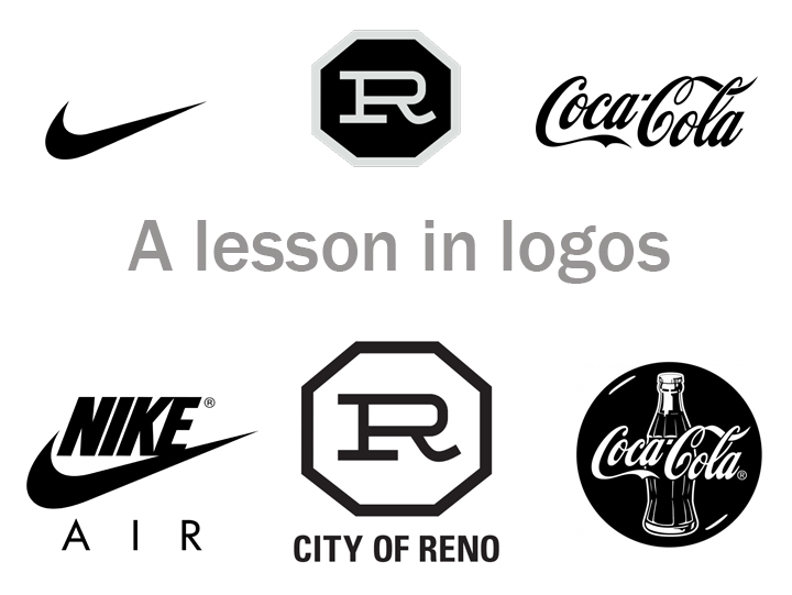
In my decade+ of graphic design experience I had never seen design criticism in such magnitude. A whole city with an opinion! If only Logos were on the ballot in November, the polls would be filled! I have been watching the Biggest Little City campaign for the last few years with glee, admiration and respect. I had the privilege of attending a luncheon that explained all the details, the passion, the reasoning. It was the ultimate Logo Presentation, and the citizens of Reno who never had a chance to attend--certainly missed out. So let's go through some of these SUPER GREAT questions/comments that have been surfacing in Reno's great design school, Facebook University, where people go to hone their art and graphic design skills so they can fit in with the Teslas, the Apples and all the other innovative Joneses that are so far ahead I am wondering if Texas wants a second shot at the bid. Question/Comment #1: It looks like a cattle brand. We don't need no stinkin' cattle brand. We ain't no cow town! Well when you put it like that! See the image above. All great logos can be turned into cattle brands. The term branding came from cattle branding--it is how a rancher could distinguish his cattle from the neighbor's cattle. Just like when you go to a store and you want to grab your favorite brand, you look for the tag, the label, that signature button. It's usually not super obvious, just tucked inside the collar; but God, you get a sense of pride when you have your favorite brand rubbing up against your body all day. The Reno BRAND is subtle and simple--the way a good brand should be. It works on a subconscious level, tucked into a corner, supporting and identifying whatever wall, sign, shirt, store or project it is attached to. Your psyche spots it as you walk by, and you smile. You're not sure why, but there is something inviting about that building, that event, that business. You want to go in, something is beckoning you! That is why it looks like a cattle brand! Question/Comment #2: It's too simple. Again, look above. The beauty of a simple logo is that it can evolve and function with more complex concepts. Have a white wall? Use the black version of the logo. Have a black wall, use the white version. Want to call it Christmas in Reno--try it in Red and Green*. I'm sure you can recall a few variations of the Nike and Coca-Cola logos. Successful marketing operations rarely go back to the drawing board completely; they just make variations on the theme. Why? We don't want you to have to rebuild a psychological impression every time the seasons, the dimensions of a billboard or the Facebook timeline cover requirements change. By utilizing a simple logo, other concepts can be built around it. Yes, it is simple. Awesome! Question/Comment #3: It looks like my 7 year old made it. Your 7 year old should probably go into graphic design immediately. Question/Comment #4: It's so old I think I've seen this before--when I was a baby. Hey--no one asked you your age, but since you volunteered--yes, great designers pull from historic elements of a business (or city) to give a timeless appeal to a logo. The logo is a throwback to the original Reno Arch. No one is looking to rewrite Reno's history; the creators understand that Reno's history is part of its greatness. But they also get that Reno's future can be even greater. Question/Comment #5: Stop? It's a stop sign!!?! OMG!!!!!! PANIC. An octagon is a respectable shape, and I don't think STOP has it trademarked. It's up for grabs, people! What does an octagon mean to you? Why do you associate that with a STOP sign? And why is that a bad thing in your mind? I just LOVE the psychology behind a good logo! A great logo WILL make you STOP and think, question, evolve. It might even make you want to STOP and stay in Reno for the night, the week--hell, maybe forever. But if you just can't handle the idea of more people stopping in Reno, consider a higher meaning of the octagon which deals with: Regeneration; Totality; Infinity; Rebirth; Transition. Huh. That sounds oddly appropriate. Question/Comment #6: Why do we need this. The old one is perfectly fine. I didn't even realize we had an old logo until this discussion came up. Then I saw the old logo and was reminded, "OMG that thing?! WE HAVE A LOGO AND IT IS SO 1997." I'm not going to bash it (much) because the previous logo was designed by committee and through intense government regulations. It fits all the requirements of the Facebook community, and well--that kind of explains it, doesn't it? To stay relevant to my clients I have to update their websites every month. And then we have to do whole website overhauls every year--just to keep up with technology. As businesses grow and they realize that their original image is no longer relevant--we have to also change their logo and branding. Reno is in an exciting place of transition and innovative growth. It's time for all of Reno to not only consider a new logo, but also a new wardrobe, a new career, a new place to dine, a new habit, a new route to work. If you're still comfortable with the old logo, it may be time for some deep spiritual introspection--what else have you been putting up with for the last 15 years? An abusive relationship, a horrible boss, an extra 40 pounds? Rebrand yourself. Tell the people that are bringing you down to STOP; you're getting a new logo, a new look. Hopefully the Facebook Community will be on board with the new you; I know I will! *provided that is allowed under the confines of the branding guide. |
Categories
All
|


 RSS Feed